Written by Pengalu - September 14, 2023
Cardboard Engineering
9-14-23
Research
Didn’t get to journal yesterday but the content in this update stretches back to 9-13-23.
Yesterday we entered our research phase by coming up with a list of designers and architects whose styles we could use to develop our piece. I was a big fan of Ronald Knol’s work, mainly because it could be achieved using our primitive materials. A.G. Fronzoni had some beautiful graphical designs but his furniture works were less striking. Kendrick Kellogg was another interesting choice, and the idea of using his High Desert House work as inspiration for a tabletop shelf / storage rack was interesting, but ultimately we decided against it, even though it was close. Other suggestions included Zaha Hadid- whose style we didn’t all agree on- and Frank Lloyd Wright- the creator of Falling Waters.
Ultimately, it was the work of Jürgen Mayer- and his firm J. MAYER H. that beat the other contestants. We determined the final architect via a Pugh chart. We drew most of our thoughts on Jürgen Mayer from his work in Seville, Spain- the Metropol Parasol. It acts as a covering for a parking garage and plaza, but we realized that you could very easily integrate a similar cross-hatched, natural design into a table. Our Pugh chart rated all the contestants based on 4 criteria: Viability, Style, Strength, and Cad-ability. Mayer placed highly in viability for construction, style, and strength especially because basing the design of the furniture piece off of an actual canopy-like structure would make it easy to have a mostly clear space below it. Unfortunately, Cad-ability was low- the cross hatching was a concern, but we decided it’d be worth a shot after Mayer’s work beat the closest other designer- Frank Lloyd Wright- in most categories.
Prompt Question: What part of the Engineering Design Process do you believe will be hardest for you? Why? Conversely, what step will be easiest and why?
I honestly can’t decide whether the creating or planning phase will be the hardest. Working with random scrap cardboard will be challenging, especially with the natural flow and cross-hatching in the designs we’re inspired by. On the other hand, we definitely had an easy time researching and defining design criteria- can it hold weight, does it look cool, can we make it. Ask / Research was pretty light on our end.
9-20-23
Plan
Song of the day: FREE by exociety
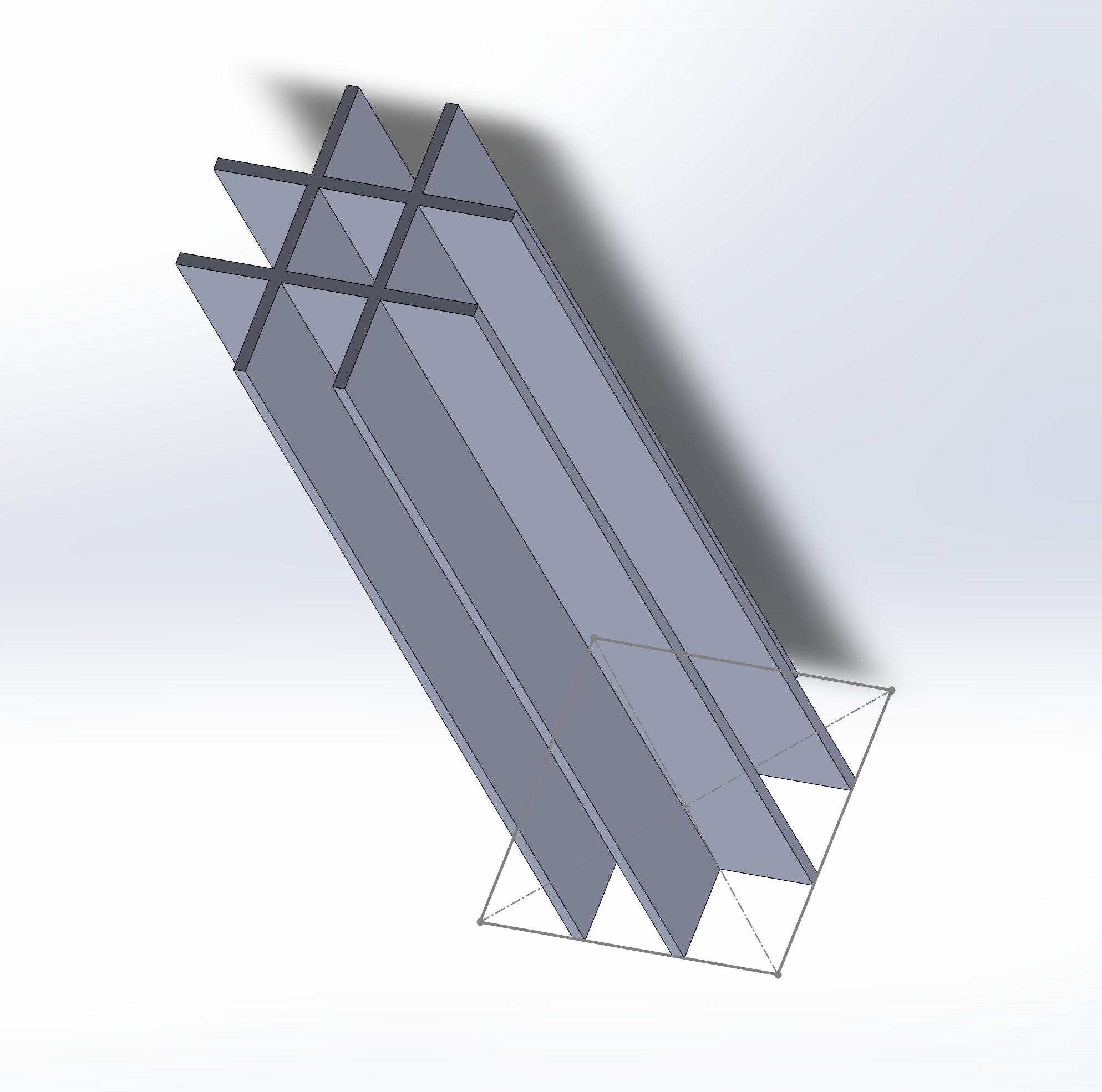
Friday last week was spent CADing. I’d categorize that as the plan phase. I’ve been doing work on the leg part of the table design while Owen coaches me through sketching. On Tuesday, we ended up adding line width to the lines on the leg and extruding it to our desired height- around 16 inches if I recall correctly. It’s a basic grid-like pattern with the inner lines given width for the extrusion. About 4x4 inches in size if I remember correctly, with 2 lines travelling through both vertically and horizontally.
Finished leg:

Overall, the CAD work is coming along well. Akash is doing the main surface of the table, and it’s coming together nicely. We opted NOT to CAD the more natural features plastered onto the inspiration piece and instead do that fully manually. It’d just be a pain to CAD and not really worth it since we can’t realistically be that precise with cardboard. We’re hoping the natural curves and such associated with Jürgen Mayer’s design will help bring the table enough stability to hold… something? What exactly that might be is undecided to some extent.
9-21-23
Plan/Test
Song of the day: 00. ~OUT ON THE STREET~ by Adolf Nomura
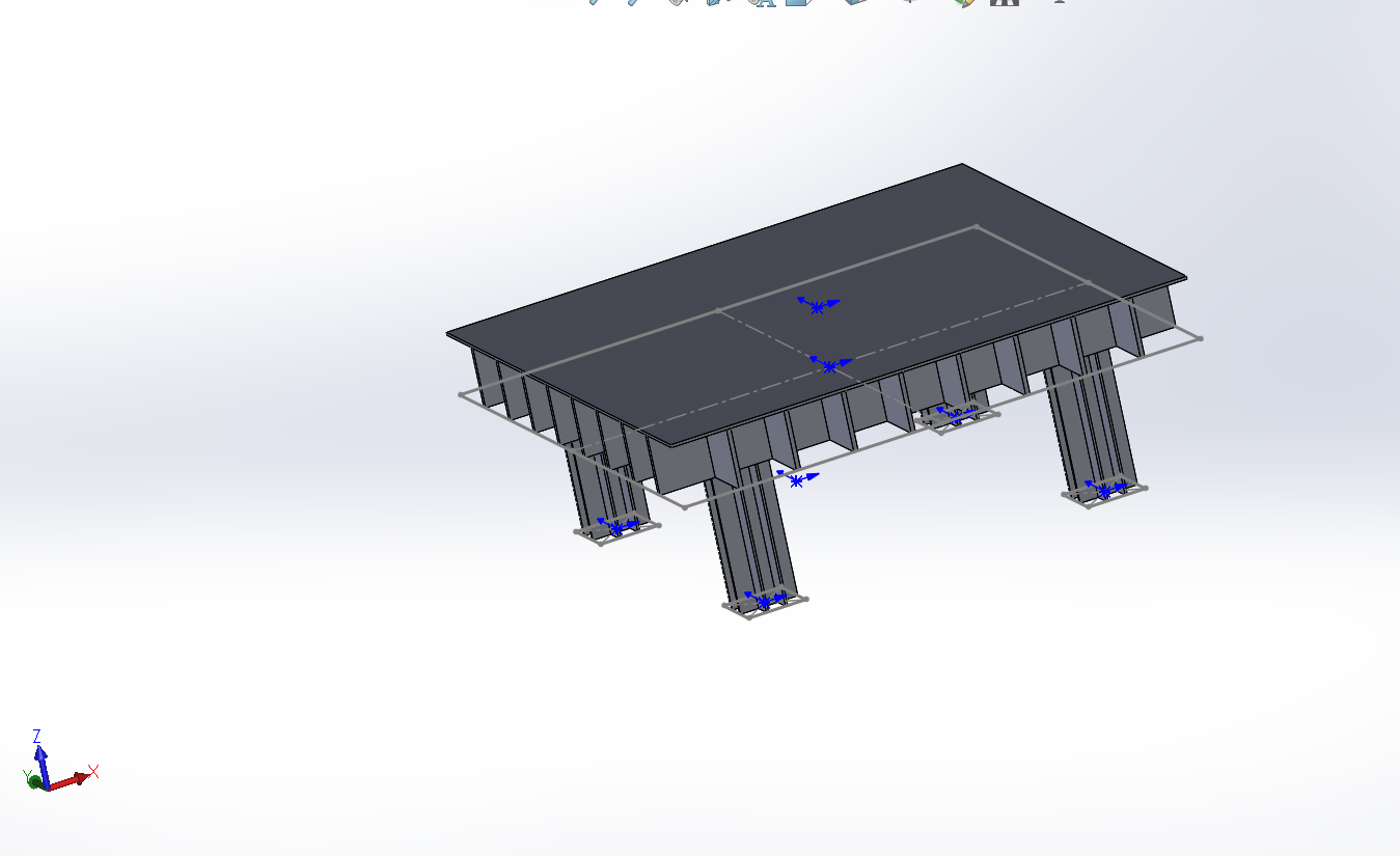
Today we tested our hypothesis by presenting with other groups. Our goal was to hold 2-4 filled coffee cups, using the crosshatching to make it more stable. Among almost every group I personally talked to, we were told that the grid-styled legs may not be stable enough to even hold the weight. They could crumble immediately undeer the weight. Also, if placed in the center, the mugs might be too far from the legs to hold up the surface properly. We also received feedback that the design may be less interesting if it’s not visible through the surface of the tabletop, which originally had a flat surface to distribute the weight evenly.
Pre-Feedback CAD:

We gave some feedback- most notably to Anika and Jacob regarding how they might have to consider strengthening the interior to prevent collapse and also the # of pillars used being changed to reflect the artistic intent often seen in Grecco-Roman works. Their project is of similar size to ours, so we’ll likely face similar challegnes.
9-22-23
Improve
Song of the day: Kind of Blue (Miles Davis)
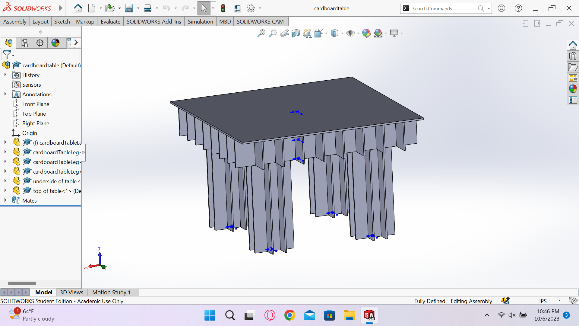
We entered our improve phase of the design process by just changing around the CAD model to be a more reasonable size. We originally had the size around 48x48 inches but decided to change the surface size to 32x32 inches to more easily manage weight in the center. We also considered that implementing the wavy / curvy structure may be too much of a time sink while building and may be more of a wish / afterthought. Aside from that, we spend most of today just mapping out and planning the cuts for our actual build day.
Final CAD:

9-26-23
Create
Song of the day: out of body by exociety (<3 meltycannon)
Today we started the create phase of our process for this project. It, quite frankly, is not going too swimingly, but we’ll work through it. The largest problem is cutting cardboard takes eons, we have to make 16 cross hatch elements to put under the table face and with 3/4 of our group members it took us a good 30 minutes to make 6 of em. At this point, I think we might consider downscaling next work session because we still ned to produce leg pieces. Aside from that, cut, glue, cut again.
Start of construction:

9-28-23
Create/Improve
Song of the day: Face First by Stage Kids
Over Wednesday and the beginning of today we fully commited to a new plan for constructing our table. Firstly, we dropped the waves, it’d take too long. It now looks more similar to the CAD. Secondly, the legs are no longer the tic-tac-toe like grid that I designed but now uses only 2 pieces of cardboard crossed together to create the legs. Overall, I think with the new changes we will have enough time to finish building.
9-29-23
Create
Song of the day: Lungs by Ben Beal
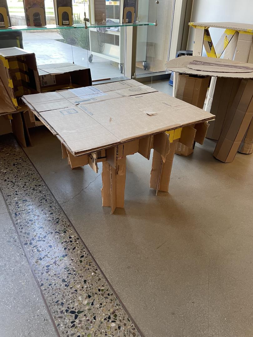
We concluded our create phase of the project today by finishing our whole assembly. We cut a couple more cross-hatch pieces and got as many as we could attached before gluing down the legs. The crosshatching wasn’t very secure either, so we places glue along every joing and used tape to prevent it from moving while drying. We will begin our test phase sometime next week, alongside finishing the posterboard for the project. Overall, I’d say that although we had to drop our original plans, we do have a final project with a roughly decent scale and an interesting- albeit unintended- design.
Final picture:

10-4-23
Create(?) & Test
Song of the day: Final Boss by exociety
I should cover what we did yesterday since I forgot to journal on that. I wouldn’t really be able to categorize it into a specific phase but I guess the build phase if nessecary. We just worked on a poster board with some content about Jürgen Mayer and how we drew inspiration from him and changed our CAD over time, similar to what’s outlined here.
Today we went around and critiqued the projects of other groups. I found that most of the chairs and seats designed were very sturdy and capable of supporting my weight and there were some really awesome shelves as well. One group made really good use of natural features at the base of their shelf where a pillar extended to hold up shelf units above the ground.